Maine’s Rothko Inspiration

P1070376

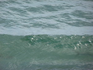
Transparent. Reflective. Abstract. Real. All at once.

That’s how I view quick snapshots taken while walking along York Beach, Maine last summer when the water was at least 55 degrees warmer than today. I was playing with my compact camera simply letting it do its thing–opening and closing the shutter and allowing light to come in. It’s these impulsive, unscripted images that allow for some interpretation as well as connections to other seemingly unrelated things. A Mark Rothko painting (famous for his color field approach) for instance, seems to have been inspired by a seascape such as the one I’ve posted here. This kind of simplification can be a show stopper when the rest of the online world is showing/displaying an incredible number of images every second of every day. I’m tired just thinking about it. Thought for today is simple, simplify.

rothko lo res Blue Divided by Blue, 1966, Mark Rothko, 1903-1970.

State of Maine Blues

Surrounded by Blues

Surrounded by Blues

Coastal Maine with its crisp whites, deep blues and accents of reds and oranges continue to find their way into my artwork. One day it occurred to me that if Maine redesigned its state flag it could look something like this. Of course inlanders would not be happy so I’ve kept this idea to myself. One visitor to one of my outdoor show in South Portland, Maine this summer laughed out loud when he saw the title and “got” the image. A fun moment. Not a sale but just as rewarding when someone understands that my work is not representational but seeks to propose a different, uncommon way of viewing common views. I abstract elements of a landscape and reorder, repurpose and reimagine all while filtering this input through my head and heart. Whew. Amazing how humans work.